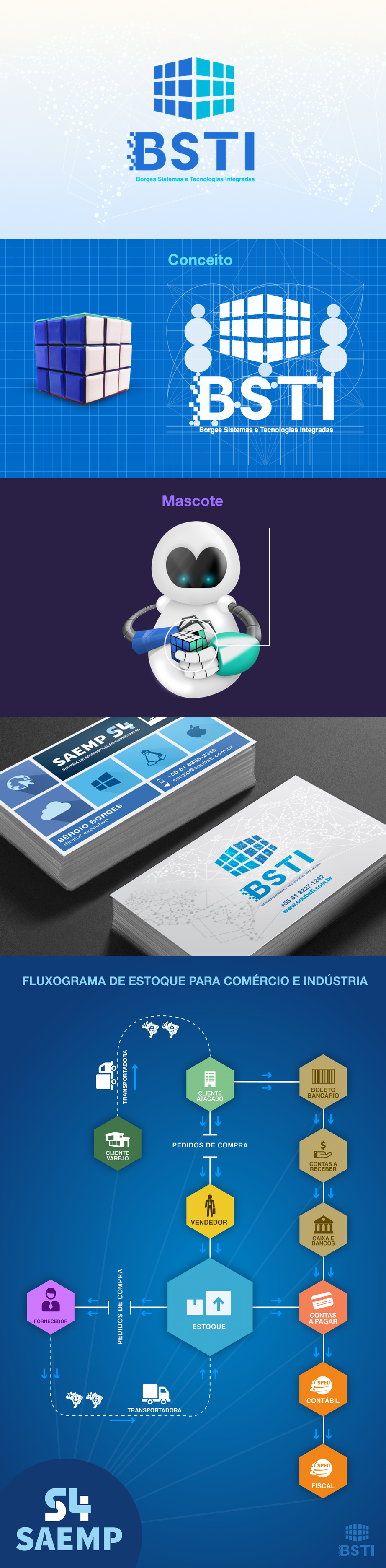
New BSTI Branding. Business focus on make ERP software.
We want to create something it can shows all of ERP's modules, also, identify with technology and math.
We think that the best way to show every ideas that the company wants to show is making a Rubiks Cube. This cube needs logical and an algotithm to be solved. Thinks that also represents IT programming. Each square it used to design the cube represents a software module.
We think that the best way to show every ideas that the company wants to show is making a Rubiks Cube. This cube needs logical and an algotithm to be solved. Thinks that also represents IT programming. Each square it used to design the cube represents a software module.
Typography
The type used is a modified version of Helvetica. We choosed helvetica cause is the most strong and confiability font family to read. Its elegant and pratical. The changes we made adds some separations on logotype and add pixels to make a tech introdution on logo.
Colors
Blue was already the main color of company. But we choose these shades because its better to recognaze differences using contrasts. Also blue is used to make brand looks more trusty.